My old design lasted a long time. In fact it was the design that I launched this blog with in 2009. I loved it when I launched the site as although it wasn’t the easiest design on your reading eyes it had a certain shock/wow factor. Times change though, so i wanted a fresh look – and i wanted to claim some of that wow factor back – So if you’ve been reading for a while you’ll notice that the change has been quite dramatic. As always though, the Ninjas had to stay.
Circa 2009-2011
I realised more and more that while i liked writing content for the site i was sometimes unable to fully read an article because of a lack of readability/contrast. Part of this was my dated TFT Lenovo x61 screen (Lenovo loves to release dimly lit screens).
New look & feel
If you take a look around at the 2011 blogosphere everyone has made been making a big deal out of readability. Hanselman has made the change, Jeff Atwood of Coding Horror has always been all about it, and you only have to take a look at the new Microsoft/Windows Phone Branding to get a feel of where things are heading. Content is King and making it as consumable as possible is the key.
With this in mind, I pulled open Photoshop and went to work creating something new.
My thoughts included:
- The Windows Phone Metro design guides.
- Jeff Atwood’s love of white and space.
- A love of more minimal designs
- Making it all above the copy
Speaking of Ninjas, over the years many people have asked me how I drew or where i got my Ninjas from. You have probably seen similar ones around the interwebs a few times. Stackoverflow even has a banner that has similar Ninjas for all the world to see.
The story behind them is simple. I drew them in Adobe Photoshop using a tutorial for Adobe Illustrator from Chris Spooner over at Spoon Graphics. I must thank Chris for this great tutorial – even though it actually taught me more about Photoshop than it did Illustrator as i had to do it the hard way and create vectors and smart objects in Photoshop.
HTMLification
I am very lucky to be surrounded by oober cool/intelligent developers at my day job, so was very excited to have our resident Dutch HTML/Client-side Guru John Van Der Loo around to help me with making the new design awesomely HTMLified. Like most developers I cut my teeth on HTML years ago, and like most developers who don’t specialise in front end development you’ll know that it can sometimes be a bit of a pain in the ass when it comes to niggling little cross browser issues. That’s why i brought in my resident expert.
I wanted it not only to be beautiful, readable and easy on the eyes, but i also wanted maximum cross browser friendliness with any bells and whistles that come with it along the way. John is one of those guys when it comes to perfection, so there was no one better to have around when putting it together.
One size does not fit all
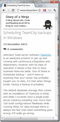
One of the great things about using new technologies such as HTML 5 and CSS 3 is that you get media-query support that allows you to build pages for multiple screen sizes. No longer was the site going to be limited to 1024x768 viewers (or me on my Lenovo x61). Everyone could be happy. Even those of you tuning in on your mobile devices on the train to work (well at least if noone else is, i am…) get get involved. If you have a large screen you can see it all happen before your eyes magically just by resizing the very window you are reading this post in.
Mobile
Mobile landscape
800x600
1024x768
1440x900 and higher
HTML 5/CSS3 Love
Another really cool feature of CSS 3 is transforms. If you hover over the Ninja’s in a browser that supports transforms you will see an Easter egg hidden on the site – the Shuriken’s spin on the second Ninja.
@-webkit-keyframes rotate {
    from {     -webkit-transform:rotate(0); }
    to {    -webkit-transform:rotate(360deg); }
}

@-moz-keyframes rotate {
    from {     -moz-transform:rotate(0); }
    to {    -moz-transform:rotate(360deg); }
}

@-webkit-keyframes rotate2 {
    from {    -webkit-transform:rotate(720deg); }
    to {    -webkit-transform:rotate(-720deg); }
}

@-moz-keyframes rotate2 {
    from {    -moz-transform:rotate(720deg); }
    to {    -moz-transform:rotate(-720deg); }
}

@-webkit-keyframes rotate3 {
    from {    -webkit-transform:rotate(-1080deg); }
    to {    -webkit-transform:rotate(1080deg); }
}

@-moz-keyframes rotate3 {
    from{    -moz-transform:rotate(-1080deg); }
    to {    -moz-transform:rotate(1080deg); }
}
John has also used all the new HTML 5 semantic tags such as article, nav, header, footer and section (along with using Modernizer to allow all those IE 6/7 users to still see everything). Awesome!
All up I really like the new look and I hope you do too.
Let me know what you think.


Comments