I’ve been lucky enough to get my hands on a Lenovo ThinkPad X240 test device for a review. Lenovo has been making a number of changes to their line of business notebooks recently, and I wanted to get in and get my hands on one to check it out, as a developer first and foremost and a ThinkPad zealot second. The changes made to the new line of devices are numerous – some changes awesome and innovative, while others leave you pondering the overall direction. Will I be buying one? Read on the find out.
If like me you’re a developer who has a ThinkPad obsession you’d have been watching the last few years of Lenovo’s stewardship over the ThinkPad brand of ultra-portable, oober-powerful business laptops with keen observation. ThinkPads are a little different from other laptops on the market. Rugged, high performance, and designed with purpose in mind without the frills. Some commentators have come to the conclusion that the ThinkPad user base base can react to changes in their beloved brand in ways akin to that of “Mac fan boys”. Their usage out in the wild in some of the most challenging environments such as on the international space station, in war zones and road warrior laptop bags, is the ownership demographic of only the best computing equipment.
I would label myself as being a part of this category of consumers. I love my ThinkPads.
I’ve owned a fair few in my lifetime as an IT professional, and currently am in possession of 3.
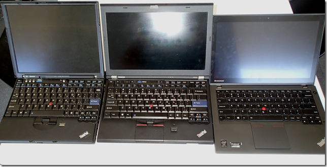
My own personal mobile coding A-Team - X61, X200, X240 (Note the extra palm room on the X240).
The X240 came out just over a month ago here in Australia, and a number of people have written reviews on the device, but not many seem to do it from a programmer’s point of view. Something that felt was missed seeing we appear to make up so much of the ThinkPad owners demographic.
In recent years Lenovo has started to cop a lot of negative sentiment among it’s long time zealot supporters, mostly driven by the following changes over this period:
- Switching away from 4:3 screens to widescreens (a good thing).
- Removing the physical buttons under the famous ThinkPad red mouse pointer (!!).
- Switching to using cheaper materials on some of the cheaper product ranges, while maintaining the “ThinkPad” labelling (“A ThinkPad without a roll cage!”)
- The removal of self-service access panels and upgrade parts.
- The use of ULV processors, that limit the speed on the processors on board in exchange for power usage.
At the same time, Lenovo has been working hard to ensure the continued life of the ThinkPad brand and that has meant having to balance the lower sales figures of high end business Laptops, with that of cheaper consumer laptops. In some instances this has actually brought welcoming changes in hardware for the newer range of devices.
- Shifting away from lower nit passive TFT screens towards higher resolution/brighter IPS based panels.
- Reducing the weight and width of their devices to keep up with market leaders.
- A general reduction in price tag for a large portion of the range to be more competitive.
So let’s take a look at how this heritage has played for and against the new X240.
General look and feel
The first thing you notice about the X240 is that just like previous X series ThinkPads it keeps with the thin and light mantra. This year it’s also accomplished something pretty special in that it’s thinner and lighter, but somehow feels like it has grown. The keyboard feels bigger, the track pad is larger and more littler tweaks which I’ll get into later.
The slight difference in thickness and weight makes for a different device than previous years as it’s picked up enough portability that I’ve found myself carrying it with me under one arm meeting to meeting. It feels like an A4 notepad or folio instead of powerhouse mobile portal PC. This makes for the usage pattern similar to that of a tablet, not a laptop.
Lenovo has kept the bullet proof design of previous ThinkPads with their titanium roll cage body, but this year a little bit less so. The screen and base are still rock solid, and the hinge design ensures that lifting the lid from one side doesn’t make the screen twist as it rotates back, but at the same time their is a feeling that there is “less there” with the reduction in size and weight. This leads to a feeling of slightly less confidence that it will survive a drop-to-the-floor-while-compiling-your-application that previous generations had. Put this down to the cost of mobility.
Under full load the fan isn’t any more loud than my X220, with some reports on the net putting this around 40db. It doesn’t get any more hot than my X220 either, passing my “coding on the couch for hours on end" without burning me” test.
Performance
If you’re at all like me, as a developer I care deeply that my workstation is fast. Laptops are exactly the same. I think your laptop and desktop are your tools of the trade – I want the best damn tools I can find. This means high performance CPUs, Solid State Disks, and lots of RAM. The GPU is usually less important to me personally.The X240 comes in a couple of flavours of CPU – i5 and i7 chipsets. My test device came with a Haswell i7-4600U @ 2.1Ghz. Sadly unlike previous generations of the X series, although this is an i7, Lenovo has broken with tradition and used low voltage CPUs for the X240.
Also breaking with previous models the maximum RAM that the X240 can take is 8Gb and there is only one SODIMM slot. That’s 8Gb less than it’s predecessor the X230 can take, while also losing the speed gained from using dual channel RAM. This is a shame and feels like a bit of a step back.
Overall the X240 didn’t feel slow most of the time, but running Visual Studio while listening to Spotify with a VirtualBox instance running the machine felt a little sluggish. Not really slow, but enough that I actually noted this enough to have a bit of a search online to see why what appeared to be a faster processor was delivering slower build times. My X220 doesn’t have this multitasking issue. What I found was that a number of the in depth reviews have found that Lenovo has built smarts into the machine to try and keep the power consumption down to keep battery time up. At the massive cost to performance.
Under full load of the CPU as well as the GPU at the same time, the CPU clock speed even gets decreased to 1 GHz permanently, with the GPU coming in a t 700-750 MHz. This is likely due to the TDP of 15 watts which decreases the power consumption levels of the CPU by quite a lot in order to keep true to this specification.
While I didn’t ever feel this was a deal breaker, this definitely says a lot about what you should be expecting with the overall grunt the machine brings to bear on tasks like running virtual machines etc.
Power and Battery
The newly labelled “Power Bridge” system is a pretty nice piece of innovation. The device has a battery built into it’s main chassis, allowing you to swap your battery without powering down. This is nice if you’re a mobile warrior, but I’ve always just opted for the biggest battery possible as they’ve always offered one large enough that I never really have to think about charging (8+ hours). I always seem to end up buying a new battery every 2 years or so to keep the battery time high – I wonder how easy replacing the Power Bridge battery will be.
In general battery life was fantastic. In a general rundown test developing with Visual Studio and SQL Management studio open got me just over 8 hours 23 minutes.
One of the greatest things about the X240 is it’s power on time. Opening the laptop from sleep, and the screen power on time is nearly instant. From Lenovo’s Deep Sleep this is less than 10 seconds until you see the login screen. This is the first time I’ve seen a Windows laptop behave with the same responsiveness that you’d get from a MacBook Pro or similar. This is the Windows device integration that Microsoft has probably only dreamt of in the past – it’s a great accomplishment.
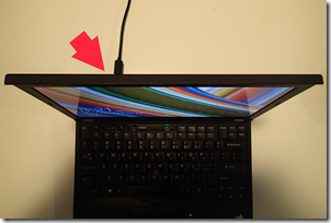
One sad thing for me, is that new ThinkPads use a different power plug to previous generations. The cable is no longer the barrel type that ThinkPad’s have had for generations, but has been replaced by a USB style thinner plug design. Sad to see all the money I’ve invested in ThinkPad power supplies go to waste (you can get adapters), but I think it’s for the best as it’s way thinner allowing for thinner laptops. What does suck is that the power plug is now on the side of the device, not the back, making it annoying to type for long periods while plugged in with the device on your lap – it’s constantly being pulled slightly left by the power cable. As it’s now a USB-like shape, the cable doesn’t really look like it’s designed to be pulled at right angles in this way either.
Lenovo X240 has side mount power, compared to previous X220 and x230 rear mount power.
Finger print scanner
Like touch, people I speak to who don’t own a laptop with a fingerprint reader mention that they “don’t see the point” in having one on their laptop. They’re so wrong. The obvious security implications aside, as a constant user of my Lenovo day and night I couldn’t go without it. My main method of login for many years now has been swiping my finger to do so.
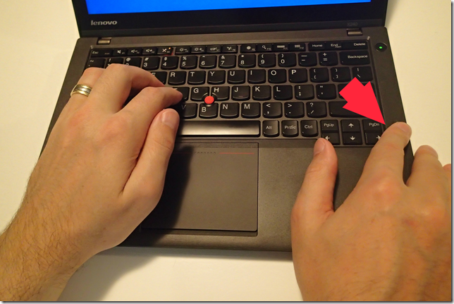
The X240 maintains this with it’s own finger print reader built into the right hand side of the dock.
Biometric Fingerprint reader – now even more “just within reach”
This is actually in a nicer location that is on my X220 and my X61 as by sitting directly to the right of the keyboard your hand has less to make less of a movement to get to it – you just move your right hand off the keyboard slightly. This makes it easier to use for other authentication purposes such as the Lenovo browser password manager, allowing you to use your fingerprint in the place of a password on your favourite websites – his gives you the opportunity to set incredibly secure passwords without the burden of having the remember them.
There is one Con to the new finger print reader though – My X220 allows me to actually wake the device from sleep using a singer swipe of my finger. This would wake the device and then login to windows. This was a very handy feature as it means that you don’t need to wait around for the device to start up windows and then hit the login box before you can use the fingerprint reader.
The new finger print reader in the X240 lacks this feature, and after some reading online it appears that this is because the original hardware manufacturer was bought by Apple, and the replacement OEM vendor doesn’t offer this feature.
Screen + Touch
The X240 comes with a few screen options. 1366x768 IPS and 1920x1080 Full HD IPS. Sadly in Australia Lenovo doesn’t sell the full HD version, so my test unit only came with 1366x768. The screen is definitely a great piece of hardware even with the lower screen resolution. It also has a matte finish making the fact that it supports touch a non-issue while at the same time making it really easy to read outside in lots of light. The viewing angle is the best I’ve seen on a ThinkPad – so much so that the old road warrior “I like my screen to be a dodgy TFT so people can’t read my secret merger documents when I’m working on the plane” excuse has to find another way home. If you sat in this camp before (and really if so, you were the one idiot holding us back from IPS heaven) you might have a problem with this. When the machine is turned off the screen actually looks like its going to look pretty average or dull, as it has a cloudy appearance when turned off. I actually have a colleague who has a T430, and his screen has the same opaque look when turned off. When turned on, the screen alone has actually made him regret his purchase – the screen on the X240 is nothing like my colleagues and is a great upgrade from panel in my X220 that I own today.
The touch screen supports 10 points of touch and is incredibly responsive. The changes to the keyboard and palm rest move the keyboard closer to the screen. This makes Windows 8 touch feel so natural. The ThinkPad’s famous TrackPoint means you don’t have to move your hands from the keyboard to use the mouse, and now with touch you barely need to move your hands to use the touchscreen either. Great usability in Lenovo’s hardware design.
Mouse
The mouse implementation on the new X240 is one of the things that has caused the most controversy online. After using it for a few weeks, the controversy is definitely warranted even if you’re a new ThinkPad owner.
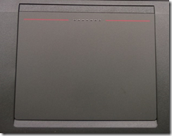
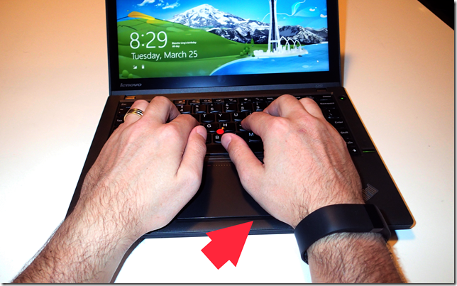
Lenovo has implemented their new Mac-style full touch pad, removed the physical buttons for use with the red TrackPoint and made the TouchPad bigger. Some reviews I’ve read complained about the mouse TrackPad being too close to the keyboard for accidental thumb touching, but I never noticed this (I think I have relatively small hands though).
TrackPad is just under your palm – Also the moment that I realised that my (Gorilla?) arms should never have their photo taken.
Another change is that Lenovo has inverted the scroll direction when using two fingers on the TrackPad to again follow Apple’s lead with the MacBook. By holding two fingers on the mouse mat, you push up the scroll down a page, as if you were pushing the page away from you. It takes some getting used to but generally I’ve found this a nicer experience, albeit not perfect as the sensitivity of the track page isn’t amazing if you’re just touching lightly; you need to add a little force for the TrackPad to respond. When “clicking” the TrackPad the whole panel moves down around 2mm under your touch which might seem odd given it’s size and square nature. Sadly although it’s spring loaded if you touch a corner it doesn’t press down evenly under your touch, but more just the corner you’re pressing. In order to action a right-click you need to press with two fingers. The TrackPad feels a little loose, so pressing it down feels a quite clumsy, while also being a little noisy compared to previous physical mouse buttons on the X series – Working in bed next to my wife coding late at night while she read a book didn’t go down so well.
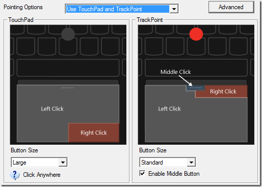
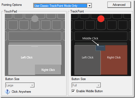
Lenovo has also removed the physical buttons from under the famous TrackPoint, making mouse use with the TrackPoint a lot less easy than previously. You can tune the mouse driver to just enable either the TrackPoint or just TouchPad, but to be honest even with just TrackPoint mode, the mouse felt a little clumsy compared to previous iterations because you’re without physical mouse buttons; instead pressing the previously uneven pressed TrackPad as a mouse button.
In “classic” TrackPoint mode:
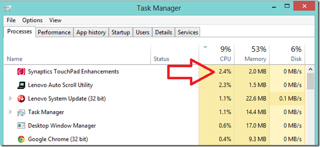
What was also weird was the fact that the Synaptics driver executable running the the background was actually using 2% of CPU resources whenever I was using the touch pad. This seems like a big performance and battery usage to pay for simply using a mouse. I assume this is related to the driver’s “Gesture” support such as listening for two-finger swipes etc.
In general I feel that the mouse situation is far from great. Working with the test unit, I have a trio of pointer options but on real sweet spot. Touch screen is great. Track point feels awesome and precise as usual, until you want to click (kind of the point, right?), making you use the track point a lot less. This then makes you switch to using the TrackPad instead with it’s slightly clumsy loud clicky touch pad and inferior(opinion) control when it comes to selecting text while clicking etc. All in all it felt like a downgrade form my X220.
The Keyboard… or “Warm and cosy, but Debugging let down”
ThinkPad keyboards have long been lauded as simply the best in the business, wining many awards over the years including Laptop Magazine’s 2006 “Best keyboard available”.
As someone who types for a living my keyboards are a huge priority for me. Fellow developer Scott Hanselman likes to say “There are a finite number of keystrokes in your life before you die.”, and with this in mind the ease of use, and quality of the keyboard you use to write your code with matters immensely.
ThinkPads have always been amazing for this, with a historic concentration on full width keyboards and longer key travel for easier long stints of typing.
The new keyboards are a Chicklet style similar to the Macbook line of laptops. I’ve normally hated this type of keyboard as they have less finger feel and confidence when you are touching typing and want your fingers to implicitly feel when they are in the home position.
Lenovo seems to have got the balance right here. Although at first you see the keys are Chiclet style, they actually still have quite a lot of travel on them, and they do still have slight grooves for you fingers to sit within when typing. I found typing on the new keyboard to actually be a real joy. This blog post was typed on the new keyboard and I don’t have a single complaint.
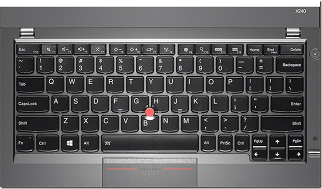
This turns me to actually what us developers really do care about though, and this is key positioning. If you’re a touch typist you operate a keyboard as if you are blind. It’s all muscle memory. The new X240 has only a 6 row keyboard, one less than previous generations. From a usability point of view this is great – the keyboard is closer to the screen making touch easier, and by doing this you get a longer palm rest and more space for a larger track pad. For development this sucks though.
The entire Function row is actually dual purpose along with the device keys like volume and brightness.
This would be so bad if it wasn’t for the fact that the F keys are actually not the default. You have to hold down Fn +[FunctionKey] to get your expected function key. This is a complete pain. When running a Visual Studio application to debug it by pressing F5 you actually now need to press Fn+F5. This was incredibly frustrating and often led me to mis-press the brightness controls when trying to run my app, and don’t get me started on walking through a debugging session pressing Fn+F10 and Fn+F11 over and over. Going full screen in a browser is now also Fn+F11.
You can inverse this by turning on the function lock (Function + Esc), but then you give up easy access to your volume, brightness and other hardware control keys.
As a developer this leaves you with a conundrum – if you can live with pressing the Fn key all the time (or giving up hardware keys) it’s a great keyboard. If you can’t, it’s a bit of a pain.
Death of the ThinkLight
Last night I was working in bed on this device when my wife decided to go to bed. She reads her kindle with the light on for about 10 minutes every night and we don’t have bed lamps.
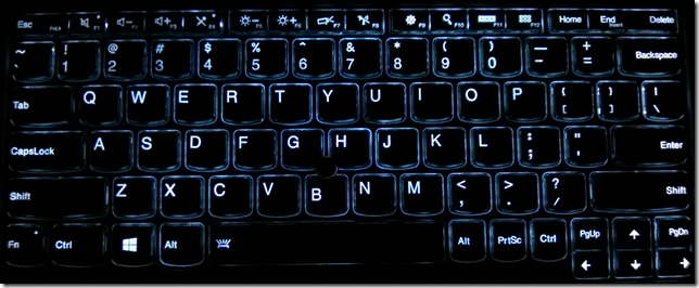
This is when I normally turn on my ThinkPad’s famous “ThinkLight”. The ThinkLight is great as it lights up the whole keyboard and mouse pad as well as giving you a little bit of ambient light – think about the type of light you’d use while on a plane flight trying to use your laptop after they’ve dimmed the light.
I was shocked at first to discover that they’ve removed the ThinkLight and replaced it with Backlit keys. The function combination to turn the backlighting is also different from the old “FN+PgUp” or as a used to remember it ”Bottom left key + Top right key” key combination. In general this is a positive change. I could still see the keyboard clearly making it easy to use. My only thought was that it didn’t light up the rest of the bottom half of the laptop well enough making it easy to miss the right click on the mouse pad in the darkness. This wasn’t so much of a detraction from backlit keys, but another observation that I needed to look at my mouse to find where to press as the buttons are removed.
Of course the removal of the ThinkLight also allows Lenovo to make the top of the display flatter as it no longer need to have a hood to hide the downward pointing LED light. And this makes the notebook thinner. A good thing. In the end though, I think giving up the ThinkLight is an improvement to the overall usability of the keyboard in low light situations.
Software
This was something I found annoying to be honest.
The ThinkPad line of notebooks have always been very limited in the amount of software that they can pre-packaged with. The software they did come preinstalled with always felt like it had a purpose (hard drive protection, backup/restore etc). They never came pre-packaged with bloat ware.
The Lenovo X240 that I received broke with this tradition slightly. There were a number of pieces of software that felt like they added very little value, while very clearly being installed simply because of corporate backroom deals done with OEM software manufacturers:
- Norton internet Security – Windows 8 already has AV built in, so why this came installed I have no idea. The dodgy browser plugins simply break the internet in my opinion by adding drive-by-modifying of your search pages. They also crashed in both chrome and IE once or twice while I was using them. This was the first thing that I uninstalled.
- Zinio magazines – This is a digital magazine retailer apps. Why is this installed on a business notebook?
- Rara.com – A music streaming service. This app is Lenovo co-branded and offers a subscription music service. Again why is this installed on a business notebook?
- Evernote – A cloud note collection app. blatant corporate OEM bundle deal.
- Kindle – Amazon’s eBook subscription and viewer Metro app.
Lenovo also had some pretty annoying software that reminded me about the optional software I could buy and have installed. Not cool. Another startup piece of software to remove.
Wifi + 4g
The last 2 ThinkPads I’ve purchased have come with the 4g radio built in. There is something about the extra productivity gained from turning on your laptop and having internet anywhere. No fumbling with your phone on the train trying to get a hotspot going, simply open up and code. I use a yearly Telstra Prepaid 12gb plan to power the thing and am yet to ever run dry.
If I could put a price on the extra lines of code I’ve punched out right after sitting down on the train on my measly 15 minute commute, I’d have paid for the $100 radio option many times over. The test unit I received has 4g powered by an inbuilt Ericsson N5321 card and connectivity over both Optus 4g and Telstrat 4g was awesome around the city on my commute into work. The SIM is also easier to get at with the X240 – my X220 requires you to remove the battery to get at the battery. The X240 has a sim slot built into the side next to the USB ports making SIM switching easy.
WiFi is offered through a pretty amazing Intel Wireless AC 7260 – AC wireless networking is blazing fast and I was able to successfully get maximum 100mbps+ speeds all around my unit while also being powerful enough to surf with speed from the street 7 floors below as well; I had a driver car pick me up from the airport one day and could use my WiFi from the street below easily(!).
Audio
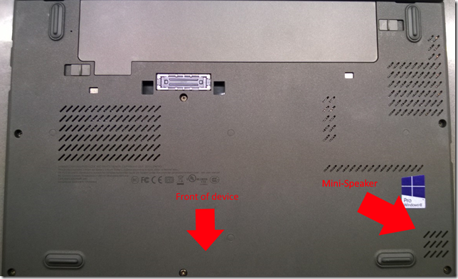
The audio and speakers built into the new X240 are actually surprisingly good for a laptop designed for people who don’t often care too much for laptop audio speakers. The normal speaker position for the X series of laptops has often been to place a single speaker right under the front of the machine beneath the keypad. This means that you are listening to a bounced audio source off the desk or table you’re sitting your laptop on. The size of this speaker was always so small that using it to listen to music was always next to useless (not that this has ever really mattered).
The X240 places this to the left under the keyboard, a place at first you’d assume would actually make sound worse. Surprisingly this position combined with what appears to be a speaker with a slightly larger driver makes for louder audio. I’d still BYO speakers or headphones if you’re wanting to listen to beats while pumping out your next release…
Buy it or wait?
The ThinkPad X240 is an incredible device with a number of things that long time ThinkPad fans like myself would turn their nose up at simply because it’s a change. Whether this is a change for the better or worse is pretty subjective and not as clear as I thought before using the device for a while. So you’d think I’d avoid buying it, right?
I almost can’t describe why, but after spending 4 days using it everywhere as my everyday machine I’m actually in love with it.
It’s so light compared to my X220 that I take it everywhere. Not the “everywhere” that involves a backpack and being parked in my office, but the “everywhere” that you take a tablet. Meetings in one hand and the around the office like it’s a paper weight.
In most cases it’s still quite fast – The talked about sharing of performance between GPU and CPU that some have mentioned online means nothing for most use cases. For developers this is definitely a big let down. Power on is instantaneous – the first Windows 8 laptop that seemed to really fulfil the dream Microsoft had with the Surface but in a laptop form factor.
The keyboard is great, but is largely hampered by the 6 row keyboard. Not only is the Chiclet keyboard the first one I’ve used that I can seriously touch type on, but the extra space you get in the palm rest leads to a truly comfortable typing position.
But I’m not going to buy the X240.
The overall ergonomics are awesome. The finger print reader is just there where you can get to it. The palm rest places your fingers closer to the screen making the touch screen simply awesome to use without having to reach too far for the screen. Generally it’s comfortable to use, which is impressive as it’s more squarish and flat that ever before. But it works. It’s fast for most things. It has a long lasting battery. It’s lighter and thinner than ever before. It has a nicer, bright, easy to read screen.
But then you use the keyboard to develop on and use the F keys. And then you use the TrackPoint or TrackPad for any length of time to do actual work (try and select some text). And then you try and multitask and run a Virtual machine while running Visual Studio and SQL Server.
It’s the definition of a contradiction. And this holds it back because all of the awesome is “almost” perfect, but annoying enough to save yourself the cash. Hopefully Lenovo will take on board a lot of the feedback from their very own site to make next year’s model (X250?) fill in the honestly small gap, holding this machine back from greatness.

Comments