Over the past few weeks i have spent a fair bit of time creating Silverlight charts for a few Windows Phone apps I've been writing. The Silverlight charting toolkit’s documentation for advanced scenarios is pretty sparse to say the least. My experience in finding information on working with the DateTimeAxis that you can use on these charts was nothing short of frustrating. This post’s purpose is to hopefully serve to better educate others in my situation.
 The Silverlight Toolkit contains a number of charting controls, making it easy to add charting to your Silverlight or Windows Phone 7 applications. My experience with it has been solely while using the latter, but the same should apply to both.
For those of you that have never written XAML before or who’ve never written anything in Silverlight simply because you’ve heard all the scary stories from days gone by that WPF and XAML are the devil and are a pain to work with. If this is you, your should really give it another look in Visual Studio 2010 and Expression Blend – these two tools have really taken any of the effort out of having to code XAML and have made it a very visual experience akin to using WYSIWG editors for HTML.
Changing the Interval on a DateTimeAxis
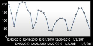
One of the most painful things that hits a line chart in the Silverlight Charting Toolkit that uses DateTime elements as its X Axis, is the default Interval that gets used. By default, if you display a month worth of data, it sets the interval to 3.
Couple this with the default display format of a full American date ( i.e 12/22/2010 ) and you start to have incredibly hard to read, messy looking charts

There are two ways you can solve this, one using code behind, and the other using XAML. I leave the choice up to you, however i must caveat this by saying that if you use the code-behind method, and don’t set the Minimum, Maximum and IntervalType, the chart becomes unusably slow. I know that you’ll note that my link above is quite old, but i only found this page because i was having this very problem – recently.
Apparently this is because the chart’s code will attempt to create an interval for every element, which by default is 30 minutes, of its default set, which by default is a year. If you think about that for a minute that means that the chart creates 17,520 data points.
Accordingly, this is not that great for performance, and the visual tree engine struggles quite a bit.
The XAML approach
The XAML approach is easy, and simply requires that you setup the default DateTimeAxis properties for a chart. Note that in my example i have set the interval to 5.
<charting:Chart x:Name="MyChart">
    <charting:LineSeries/>
    <charting:Chart.Axes>
        <charting:DateTimeAxis
            Orientation="X"
            Interval="5" />
    </charting:Chart.Axes>
</charting:Chart>
The code behind approach
Below is what you call on your chart to setup its interval from code behind. Note that i specifically set the axes Minimum and Maximum values to get around the little bug i mentioned above.
On a side note, If you are using an axis with a linear axis type, it is important to set the minimum if you have data that sometimes hits zero, as this will make the chart’s range include minus values below your bottom value. In a chart that you don’t want to show below zero, or that has minimal data, this can be an annoyance.
List<DateTime> myValues = new List<DateTime>();
MyChart.DataContext = myValues;
((LineSeries)MyChart.Series[0]).IndependentAxis = new DateTimeAxis
{
    Minimum = myValues[0],
    Maximum = myValues[myValues.Count - 1],
    IntervalType = DateTimeIntervalType.Days,
    Interval = 5,
    Orientation = AxisOrientation.X,
    Location = AxisLocation.Bottom
};
Changing the string format of the DateTimeAxis
Another thing that isn’t 100% clear is how to change the displayed string of a DateTimeAxis. Some people talk of using a BindingConverter (this doesn’t work as it changes to actual datatype of your axis element, which in a DateTime axis breaks things), others of using the StringFormat of the axis element – this is the solution.
Again you can use my XAML or code-behind approach to the same effect, by changing the string format of the axis again.
The XAML approach
Below is an example showing an Australian date format. The format string can be changed to use any DateTime format string.
<UserControl>
    <UserControl.Resources>
        <Style x:Key="DateTimeAxisLabelStyle1"
               TargetType="charting:DateTimeAxisLabel">
            <Setter Property="DaysIntervalStringFormat"
                    Value="{}{0:dd/MM/yyy}"/>
            <Setter Property="HoursIntervalStringFormat"
                    Value="{}{0:hh:mm tt}"/>
        </Style>
    </UserControl.Resources>
</UserControl>
<charting:Chart x:Name="MyChart">
    <charting:LineSeries/>
    <charting:Chart.Axes>
        <charting:DateTimeAxis
            Orientation="X"
            AxisLabelStyle="{StaticResource DateTimeAxisLabelStyle1}"/>
    </charting:Chart.Axes>
</charting:Chart>
The code behind approach
Below is the same example from the code behind. You add the same style to your pages XAML or your App.XAML. and then refer to it using code. You could create the style using purely code as well, but i suggest that you don’t as you cannot reuse your style as easily across your application.
The XAML style to put in your page or App.XAML
<UserControl>
    <UserControl.Resources>
        <Style x:Key="DateTimeAxisLabelStyle1"
               TargetType="charting:DateTimeAxisLabel">
            <Setter Property="DaysIntervalStringFormat"
                    Value="{}{0:dd/MM/yyy}"/>
            <Setter Property="HoursIntervalStringFormat"
                    Value="{}{0:hh:mm tt}"/>
        </Style>
    </UserControl.Resources>
</UserControl>
The code behind
List<DateTime> myValues = new List<DateTime>();
MyChart.DataContext = myValues;
((LineSeries)MyChart.Series[0]).IndependentAxis = new DateTimeAxis
{
    Minimum = myValues[0],
    Maximum = myValues[myValues.Count - 1],
    AxisLabelStyle = Resources["DateTimeAxisLabelStyle1"] as Style,
    Orientation = AxisOrientation.X,
    Location = AxisLocation.Bottom
};
Summary
I hope that the two little tips above save someone the time it took me to scour the toolkit API and Google to find. Silverlight on Windows Phone 7 has been a great fun to write for, if you haven’t ever given it a go, i suggest the time to dip your toes in is now… or not.
Comments